Typography in the age of automation

At UX studio, we work with AI-assisted workflows and design systems on a daily basis, and we clearly see their benefits. At the same time, automation still struggles with typography. This is not because the tools are flawed, but because typography relies less on rules and more on judgment. This is where AI often falls short, leaving typography as one of the last remaining human skills in UI design.
Let’s take a closer look at how automation, AI, design systems, accessibility, and increasingly dense interfaces are reshaping typographic decisions.
A quiet shift in how interfaces are designed
Over the past few years, UI design has become faster and more system-driven. Design systems define components, spacing, and typography tokens. AI tools can generate layouts, apply styles, and even produce complete screens from prompts.
This shift is not inherently problematic. In fact, it solves many real issues:
- inconsistent spacing
- ad-hoc styling
- time-consuming production work
But it also changes where design decisions happen.
When layouts and components are automated, typography often becomes something that is “applied” rather than designed. Text styles are selected from a list. Headings and body text are assigned mechanically. The result is usually consistent, but not necessarily meaningful.
A common pattern we see is this: a screen looks clean and well-structured, yet users don’t know where to look first. Everything feels equally important, or equally unimportant.
This is often a typographic problem, not a layout one.

The promise of AI for typography
AI tools do bring real value to typographic work. It’s important to acknowledge that before discussing their limits.
AI can:
- explore multiple hierarchy options quickly
- suggest font pairings and scales
- apply text styles consistently across screens
- help junior designers avoid obvious mistakes
Used well, these tools speed up exploration and reduce busywork. They are especially useful in early phases, when designers want to test different directions without committing too early.

In that sense, AI works well as a generator of possibilities.
Where things become more complicated is when AI output is treated as a decision, not a suggestion.
Enhancement or transformation?
A useful way to think about AI in typography is to ask how deeply it changes the design process.
In many cases, AI operates at an enhancement level:
- instead of manually defining hierarchy, the tool suggests one
- instead of applying styles one by one, they are applied automatically
This improves efficiency, but it doesn’t fundamentally change how typographic decisions are made.
True transformation would mean something else: helping designers understand why a hierarchy works, or why a certain typographic choice fails in context.
Most tools today don’t do that. They optimize for correctness and consistency, not for reading behavior, emphasis, or tone.
This gap becomes very visible once we look at real interface examples.
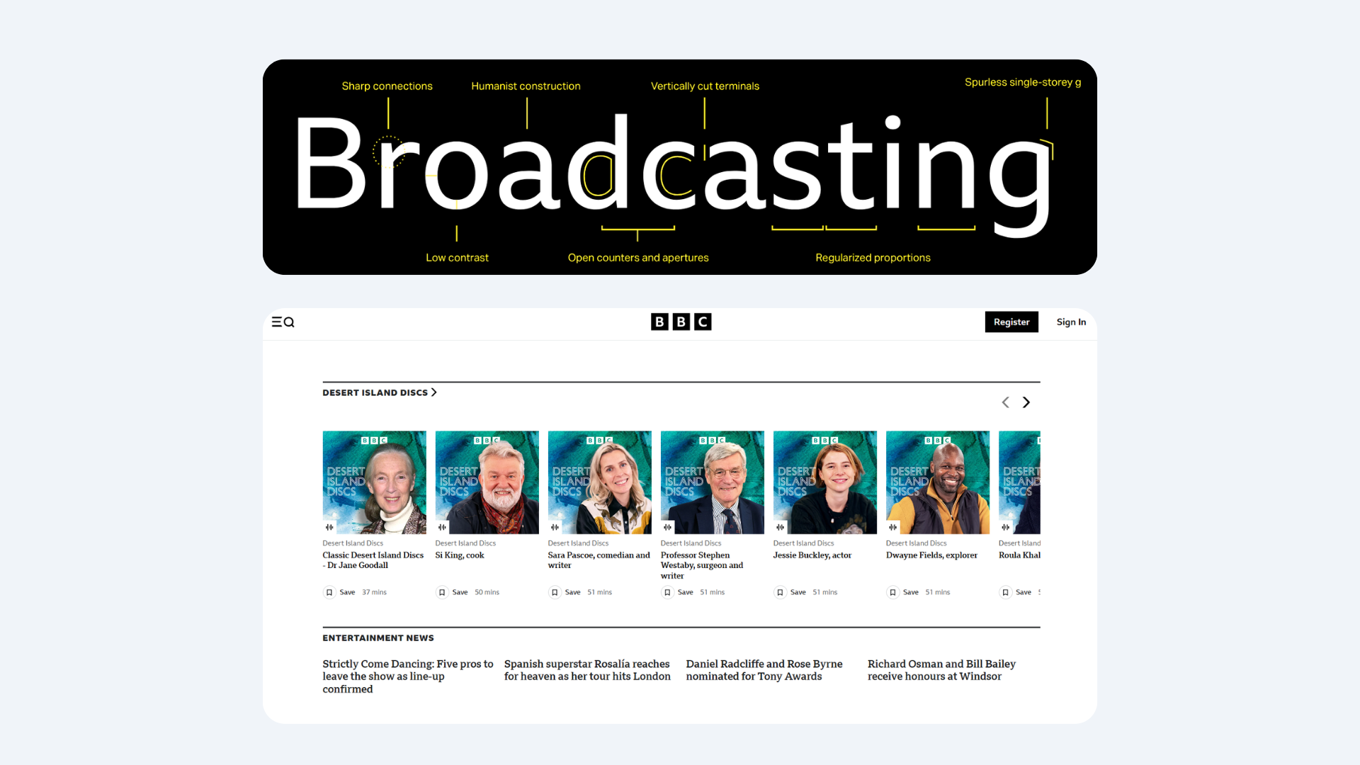
When typography is technically correct, but still feels wrong
A pattern we often see in AI-generated or heavily system-driven UIs is what could be called “perfectly fine typography.”
The text:
- meets contrast requirements
- uses the correct styles
- follows the system rules
And yet:
- headlines feel too loud
- labels compete with content
- secondary information draws too much attention
- everything looks equally emphasized
These are not bugs. They are the absence of judgment.
Typography is more than applying hierarchy: you need to prioritize under uncertainty. Deciding what deserves attention and what should quietly step back. That decision depends on context, user intent, and the flow of reading, not just on predefined styles.
AI can follow rules very well. It struggles when the right choice is not the most obvious one.

Dense interfaces are back, and typography is carrying the load
In many modern products, especially in B2B, enterprise, and AI-powered tools, interfaces are becoming text-heavy again.
Dashboards, tables, inline actions, metadata, system states, and explanations all compete for space. Minimal layouts with large cards and generous whitespace don’t scale well in these environments.
When space becomes constrained, typography stops being decoration and starts acting as structure:
- Font size replaces layout grouping.
- Weight replaces containers.
- Line-height replaces spacing.
In these interfaces, typography is the layout.
This makes typographic decisions more impactful, and also more fragile. A slightly oversized heading or an unnecessary weight variation can throw off the entire balance of the screen.
Accessibility exposes weak typography decisions
Accessibility discussions around typography often focus on contrast and font choice. These are important, but they are only part of the picture.
In practice, accessibility often reveals deeper typographic issues:
- hierarchy that relies only on color
- emphasis that disappears for screen readers
- line lengths that exhaust readers
- dense text blocks with no visual rhythm
We’ve seen interfaces that technically pass accessibility checks, yet are still hard to read or scan, especially for users with cognitive or visual impairments.
Accessibility rarely breaks good typography. It exposes weak decisions that were already there.
This is another area where automation falls short. Passing a checklist is easier than designing for real reading behavior.
Why typography still resists full automation
Typography requires a type of judgment that is difficult to encode:
- knowing when not to emphasize something
- letting body text remain intentionally boring
- removing a font weight instead of adding one
- accepting that not everything needs to stand out
Many of the best typographic decisions are subtractive. They are about restraint.
AI tools tend to optimize toward addition: more options, more variations, more visible structure. Human designers often do the opposite. They reduce until meaning becomes clear.
This is why typography remains one of the last areas where human judgment clearly outperforms automation.
What this means for designers and teams
For designers, especially those earlier in their careers, typography is a powerful place to build judgment.
You can practice it daily. You can improve it incrementally. You can critique it without redesigning entire screens. Learning to evaluate hierarchy, rhythm, and emphasis trains the same decision-making muscles needed for more complex design problems.
For teams, typography deserves earlier and more explicit decisions. It shouldn’t be postponed to the “polish” phase. Design systems help with consistency, but they don’t replace intent. Tokens don’t make choices, people do.
AI can propose. Humans still need to decide.
The role of UX in shaping AI-driven design tools
As AI becomes more embedded in design workflows, UX professionals have an important role to play.
Many AI design tools are built with a focus on speed and output. Less attention is given to how designers understand, critique, and override those outputs. Typography suffers when intent is abstracted away.
UX designers and researchers can help shape tools that:
- support judgment instead of replacing it
- make typographic decisions visible and explainable
- encourage critique, not blind acceptance
This requires involving UX expertise early, not as a layer added after the technology is built.
Keep learning with us
Subscribe to the UX studio blog for expert insight on the latest trends in all things UX.
Credits
This blog post was written by Gábor Szabó, UX designer
Editing by Dr. Johanna Székelyhidi, marketing manager and copywriter