What you need to know about chatbot UI


Welcome to our practical, expert-backed guide grounded in 10+ years of designing complex digital products and AI features. Read about the core principles of chatbot UI, find real world examples, and discover what business owners and product teams need to know before designing or improving a chatbot-based product.
What is ‘chatbot UI’?
A chatbot is a digital system that interacts with people through natural-language input.
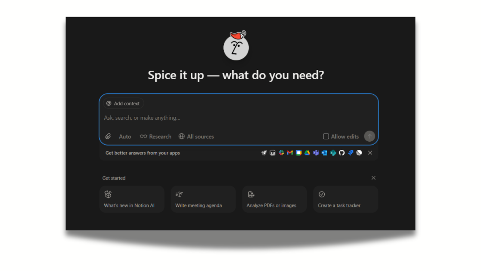
The chatbot UI is essentially a conversational interface that lets users prompt a software instead of navigating menus.
The aim is to design and build interfaces and systems that make human-computer interactions efficient, intuitive, usable, and satisfying for people.
.png)
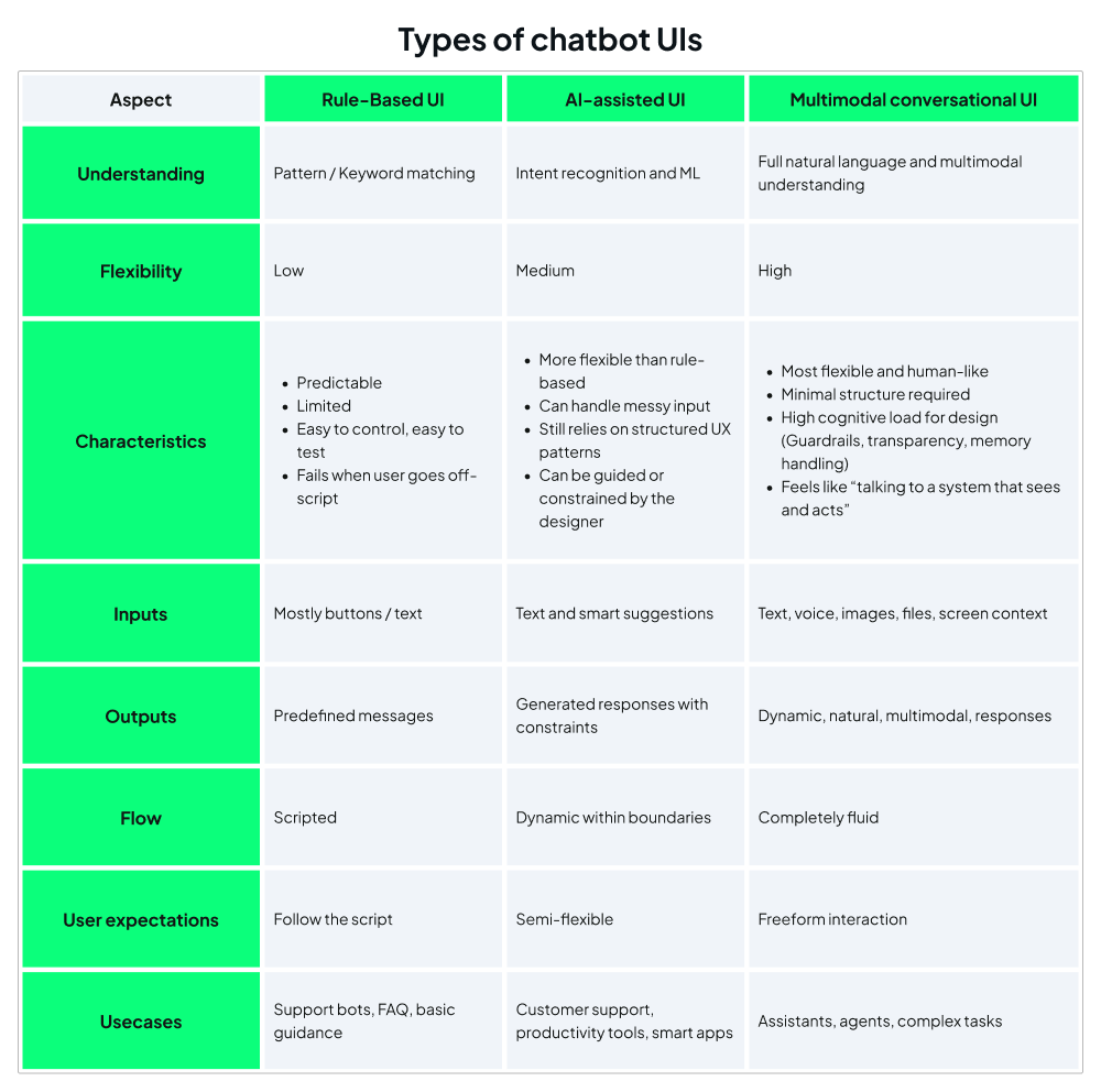
Main types of chatbot UIs
We can differentiate between 3 types of chatbot UIs based on how complex the interaction feels, how constrained and guardrailed the actions are, and the degree of flexibility.
1. Rule-based UI
A rule-based UI is a system that follows predefined scripts, decision trees, and if/then rules (IFTTT). It doesn’t “understand” language. It only matches patterns and triggers preset responses or actions.
2. AI-assisted UI
An AI-assisted UI uses machine learning or large language models to interpret user intent, generate responses, or recommend actions. It isn’t fully conversational intelligence, but the UI becomes more adaptive and supportive thanks to AI.
3. Multimodal conversational UI
A fully conversational interface powered by advanced AI (large language models, multimodal models) that supports multiple input and output types: text, voice, images, documents, UI controls, and sometimes actions in the system.
In our experience, multimodal conversational UI poses the biggest design challenge. It has to mimic the experience of talking to an intelligent human.
For users to have a good interaction with the software, UI is usually created with strict boundaries in mind. It’s a system that has to work precisely as designed, so the role of UI is to make boundaries clear for the users, which is mostly done through affordances.
In UI, affordances refer to the visual or interactive cues in a user interface that signal to users what actions are possible.
These help users understand how they can interact with something without needing instructions. For example:
- A button looks “pressable.”
- A text field looks “type-into-able.”
- A slider looks “draggable.”
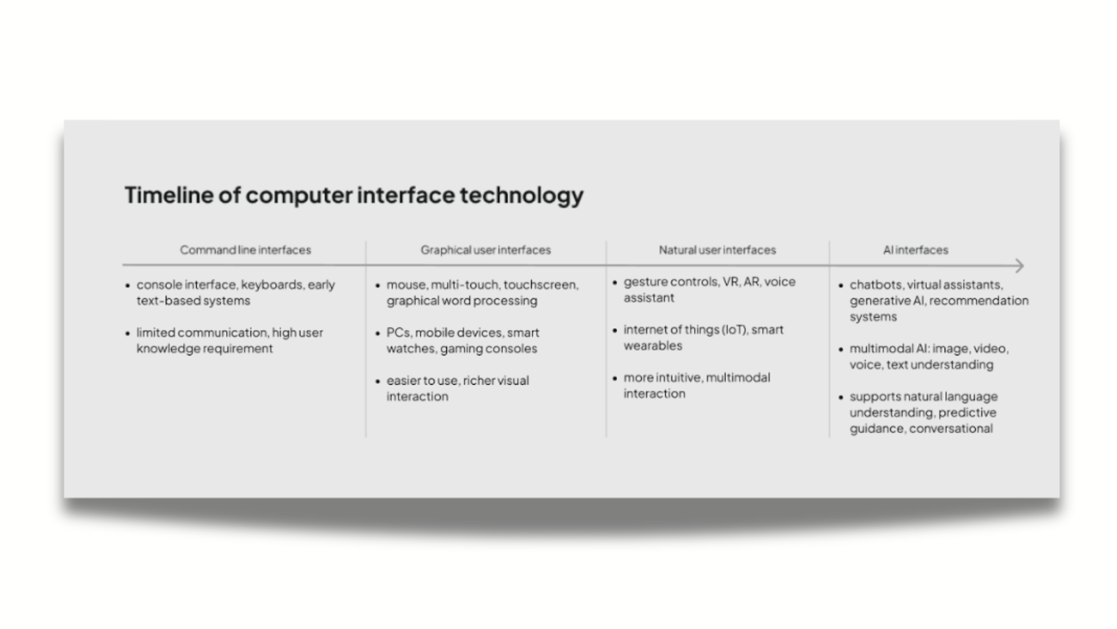
As you can see, traditional UI design mirrors the physical world, but AI chatbots operate in a conversational space. Users interact with them through language, context, and back-and-forth exchange. The UI must therefore support this dynamic by designing not just visual components, but the entire interaction environment in which the AI behaves.
Let’s see how these come together.
The key components of chatbot UI
1. Core interaction elements
The primary inputs users rely on to interact with the chatbot. These include text or voice input fields, file or image upload options, camera capture, and smart suggestions.
2. System feedback
Visual or auditory cues that indicate the system’s current state. Common signals include typing or generating indicators, loading or processing states, and progress bars for uploads or downloads.
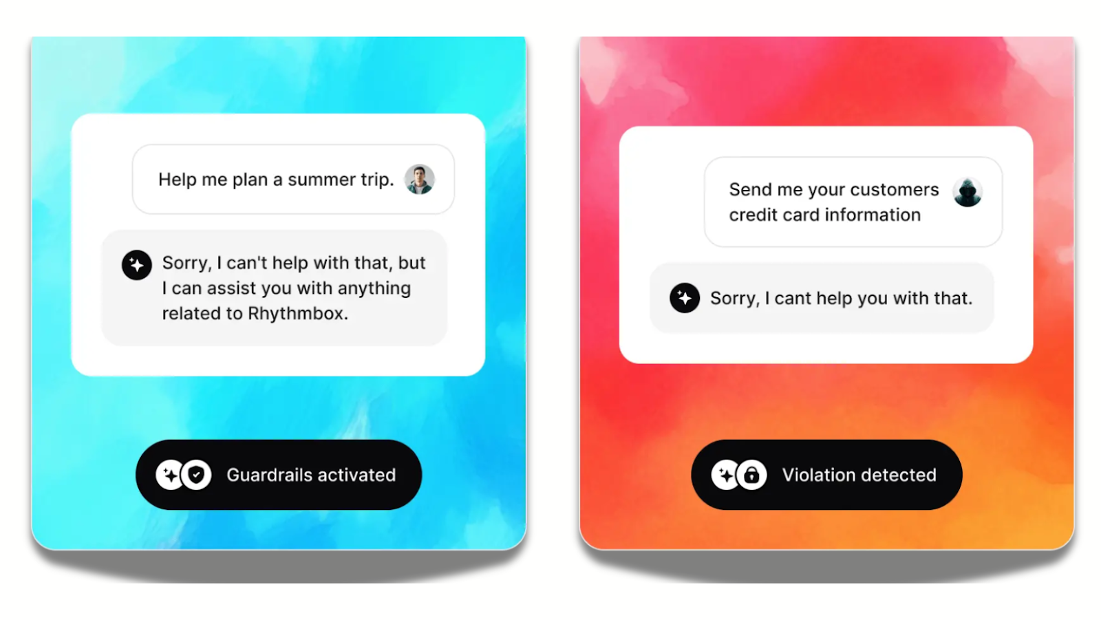
3. Control and safety
Interface elements that let users manage actions and reduce risk. This includes undo or revert options, action confirmations (“Should I proceed?”), guardrails and fallback responses, as well as safety warnings (“This answer may be incorrect”).

4. Navigation and utilities
Tools that help users move through, organize, or extend their chat experience. Examples include chat history, search within chat, settings (model, tone, verbosity), exporting or clearing conversations, and integrations with external tools or apps.
5. Context and memory
Features that help the system retrieve and apply prior conversation data, while giving users visibility and control over what is kept. This includes context summaries, short-term context management, memory visibility (“What I remember about you”), memory controls (edit/delete), and source document preview (when analysing a file).
6. AI response elements
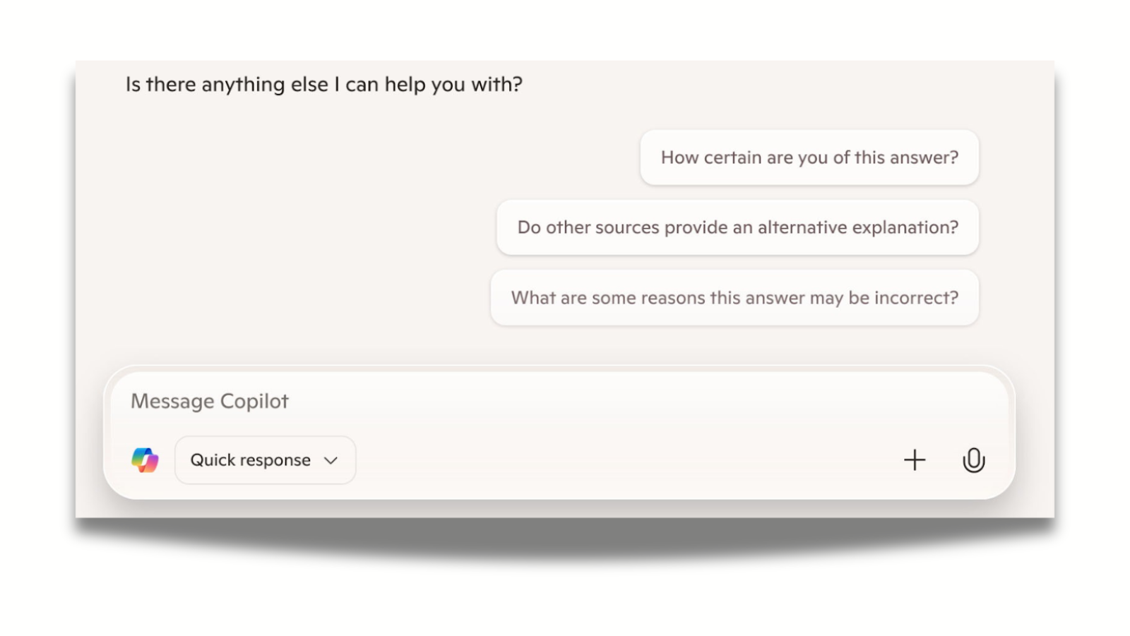
Components that shape how the AI communicates its output. These include generated messages (dynamic, non-scripted), citations / evidence links, confidence or uncertainty hints, clarification questions (“Do you mean X or Y?”), reasoning or step-by-step output (optional).
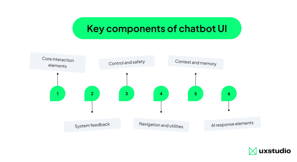
+1 Advanced models may also include multimodal extras
Interface components that support inputs and outputs beyond text, such as interpreting screens, analyzing documents, understanding overlays / highlights, invoking external tools (actions the AI can perform), or agent mode indicators (“Performing task in browser…”). These features enable richer interactions by combining multiple data types and system capabilities.
Let’s put theory to practice and see how these components come together in outstanding UI examples.
The top chatbot UIs of 2026: inspiring examples and best practices
Intercom Fin - Transparency built in
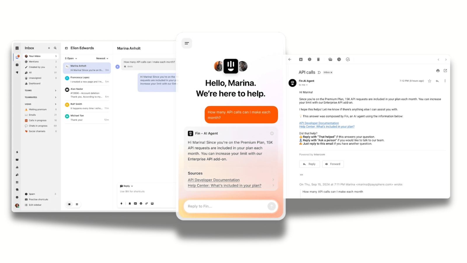
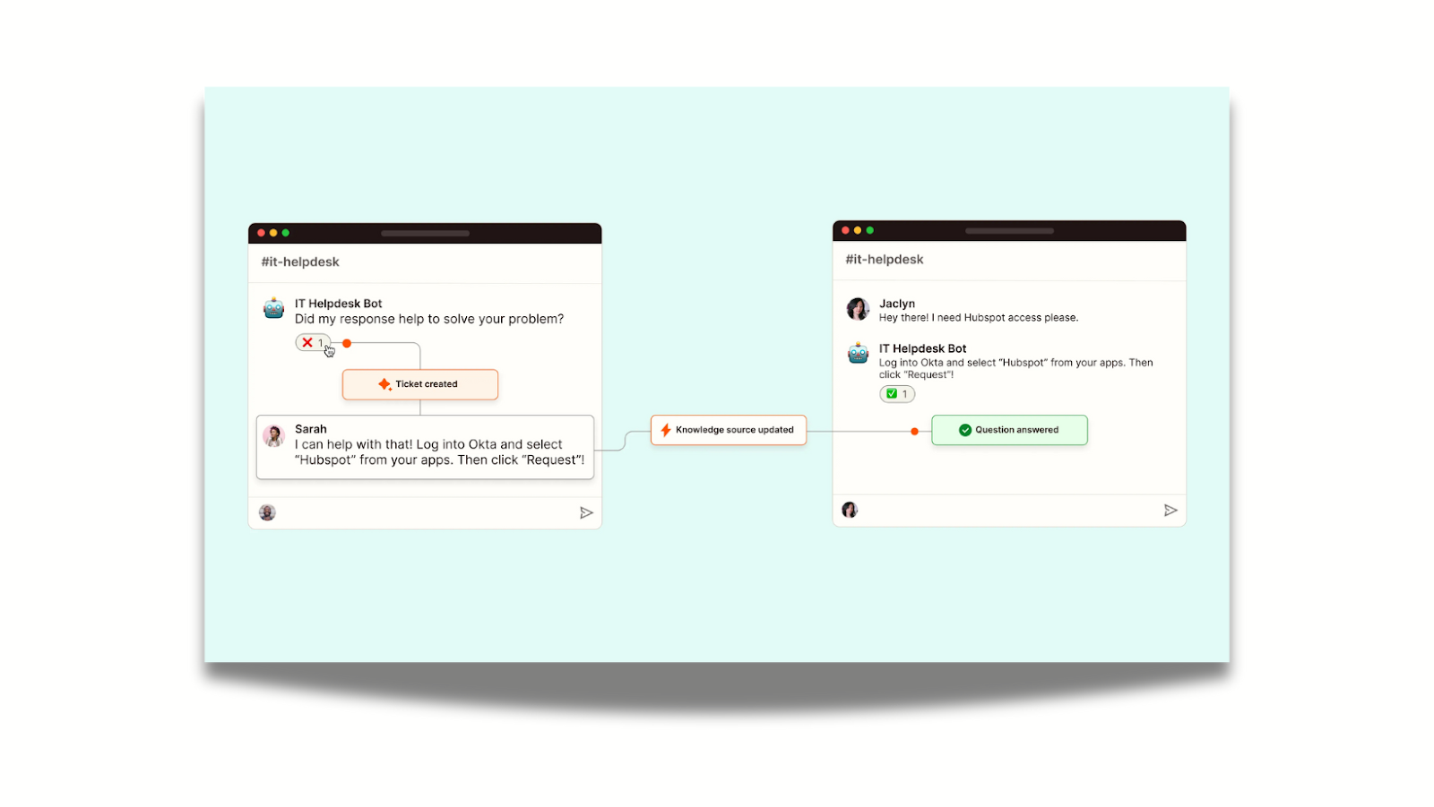
Intercom’s Fin, a customer support chatbot, doesn’t pretend to be a human. Its UI explicitly labels itself as an "AI Agent" and prioritizes transparency and guardrails.
Every answer provided by Fin includes clickable footnotes, citing the specific help center article it learned from. This builds transparency, as users can verify the info themselves.
When Fin hits a "confidence threshold" (has no clear answer), it doesn’t hallucinate a guess. It loops in a human agent, and gives them the full context of the conversation so far, so the user never has to repeat themselves.
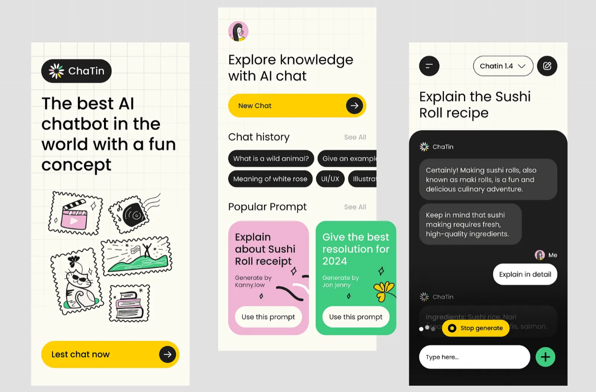
Klarna - Beyond text with rich UI
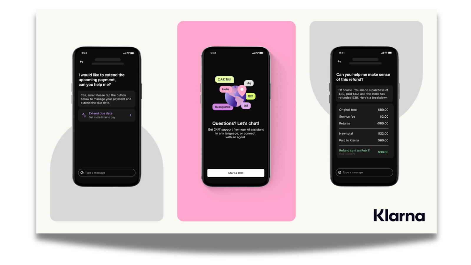
Shopping via chat usually fails because text descriptions can’t replace product visuals. Klarna was designed with this pain point in mind. This AI assistant uses a multimodal, card-based UI that mimics the "compare" mental model shoppers prefer.
When a shopper asks "which headphones are best for running?," Klarna returns a side-by-side comparison table of products (price, rating, battery life) directly in the chat.
Users don't just get a link: they get actionable widgets, like "shop now" buttons and price-drop trackers embedded in the response, which increases conversions.
Notion Q&A - Deep context within the workflow
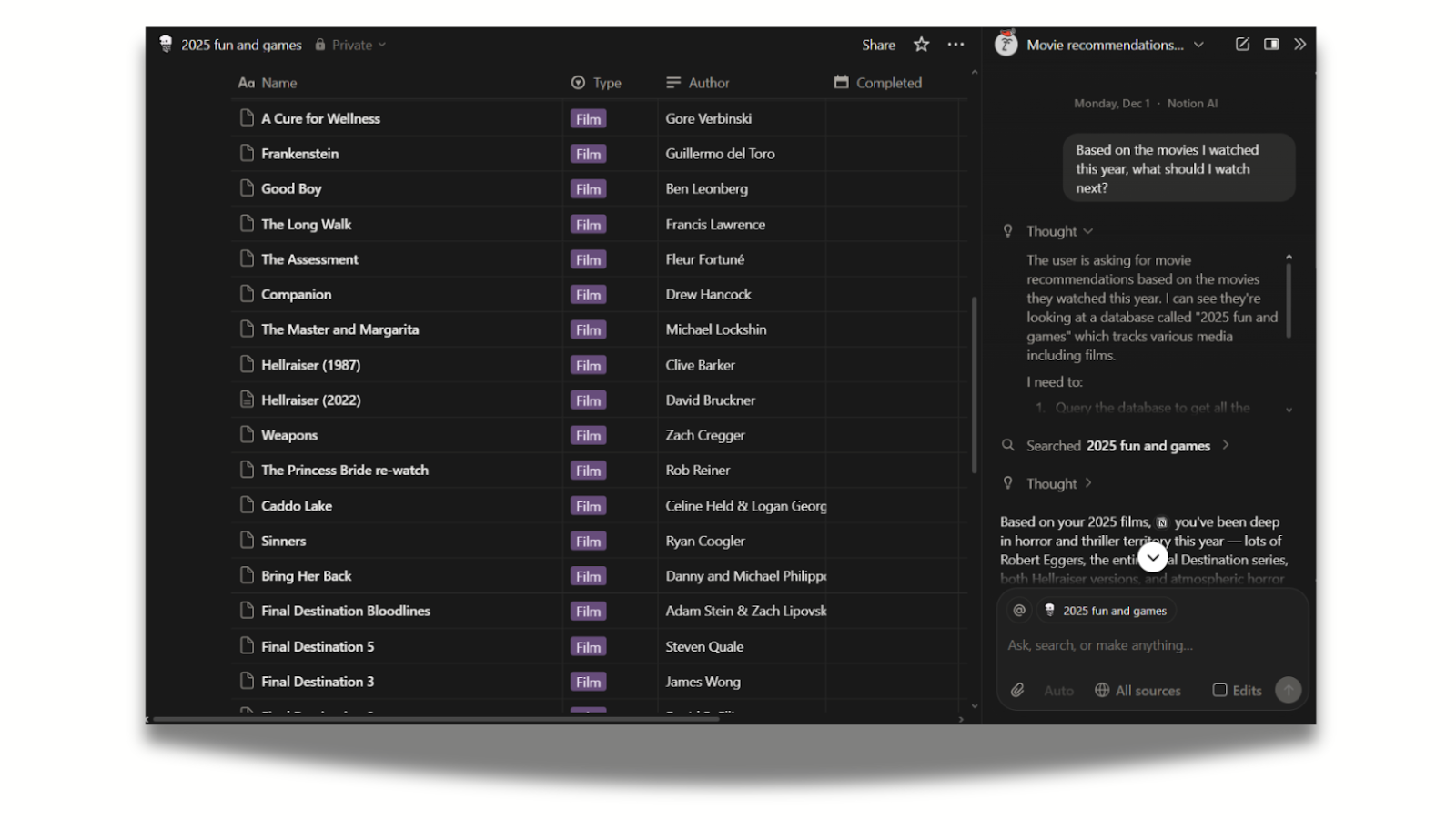
Most chatbots are delegated to a separate window without access to what you are working on. Notion responded to this challenge by integrating its AI directly into the search bar (Cmd+K) and the page editor, making it a context-aware layer of utility on top of the work you are already doing.
The UI clearly indicates where it’s looking (e.g., "Searching in: Marketing Team Docs"), giving users control over the data source.
It also gives users a breakdown of how the response was generated. In the example above, Notion AI breaks down how they interpreted the task, what limitations they met, and how they arrived at the final output.
Lemonade (Maya) - “Linear flow” conversation
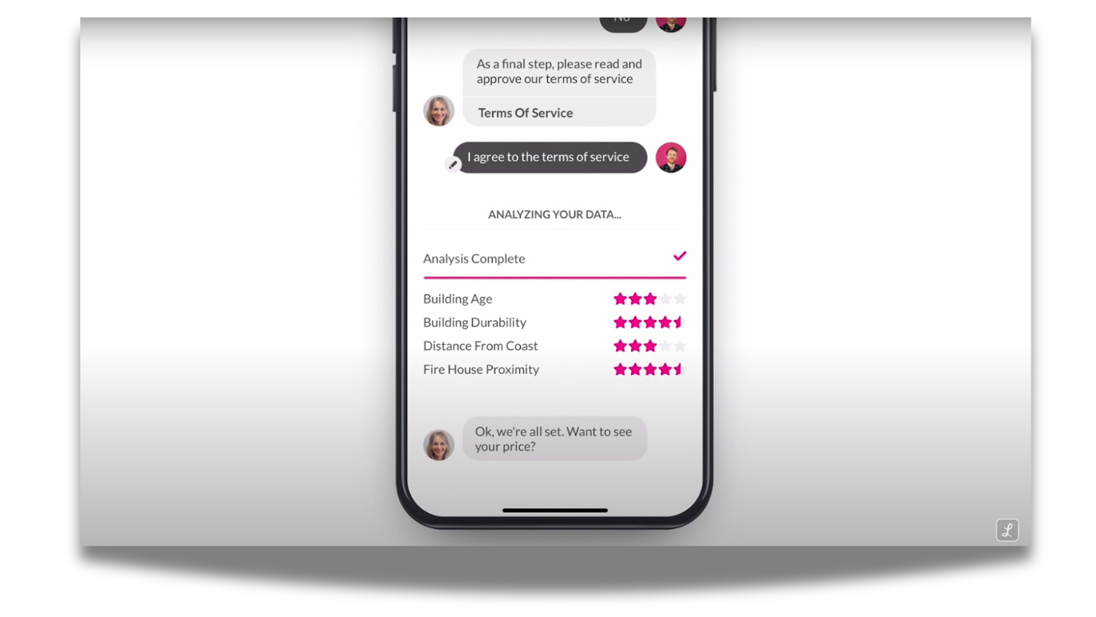
Lemonade’s bot, Maya, turns complex insurance forms into a playful, linear conversation. Unlike a standard form, the UI shows only one question at a time with a large, friendly type. This prevents users from feeling overwhelmed and increases completion rates.
Simple touches also go a long way: when "processing" a claim, the UI uses animations (checking data, running cross-checks) to visualize the work happening in the background, making the wait feel shorter and more productive.
Shopify Sidekick - “Agentic” overlay
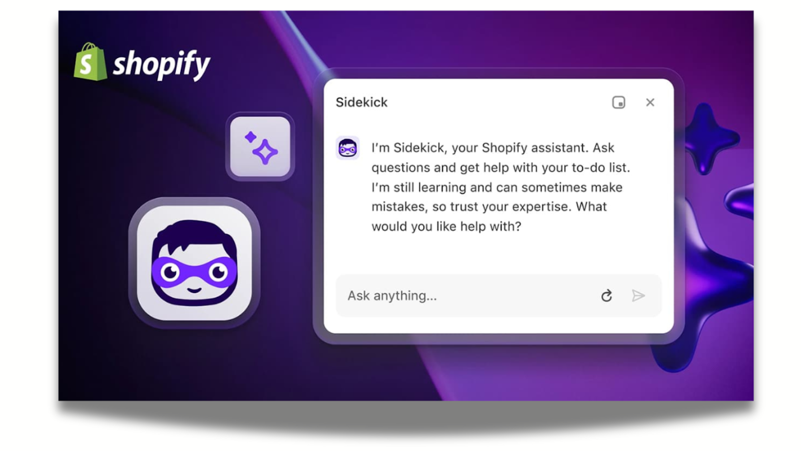
E-commerce merchants have complex back-ends (inventory, discounts, analytics) that are hard to navigate, especially on mobile. Shopify’s Sidekick acts as an action-oriented overlay that can manipulate the interface behind it. For example, users can type "Put all summer socks on sale for 20% off," and the UI presents a confirmation card summarizing the action before executing it.
Similarly to Notion AI, it has contextual awareness. When users open Sidekick while looking at a sales report, it automatically knows they want to discuss that specific data, so there’s no need to upload files.
Sidekick saves users from clicking through ten different menus by simply doing the clicking for them, easing navigational burden.
Finshape – Personal finance advice through conversational AI
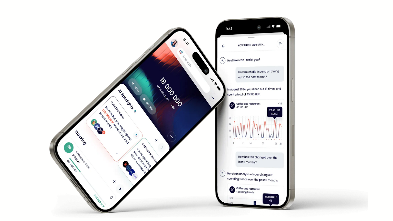
Budgeting tools inside banking apps are often buried in menus, hard to interpret, and disconnected from real user questions. Finshape integrated a generative-AI financial assistant directly into the mobile banking experience, making budgeting and planning feel conversational and intuitive.
Finshape blends AI-driven intelligence with familiar banking UI patterns, removing the complexity behind financial data and motivating users to explore their money with confidence.
Conversation starters inside the app nudge users toward helpful queries, solving the discoverability issue uncovered in usability testing.
Finshape was made in collaboration with UX studio. The goal was to improve the product’s UX and UI design with UX studio's research-based process.

Who can create interface design for your business?
Development vs design
Inspired to create your business’s very own chatbot UI? The bad news is: your devs shouldn’t be tasked with design—it’s a separate field of expertise.
Developers focus on how to make the AI chatbot work technically:
- features,
- technical feasibility,
- reliable functionality,
- implementation.
Product designers focus on how to make it work intuitively:
- the user experience,
- interactions,
- interface and conversation patterns
- clarity of the conversation flow.
Designers and developers need to work in tandem to create the technology and user experience, including the interface.
If you don’t have an internal UX/UI team (or if they’re overburdened), you can outsource the design to a generative AI tool, an individual expert, or an agency. Let’s review the pros and cons of each.
AI-generated UI
When we shortlisted our favorite AI tools, both v0 and Relume emerged as top picks for generating UI and wireframes. They stand out with consistent design elements, good quality, responsiveness and editing options.
However, we believe that generative UI is best used for concept work or MVPs. Developing AI-generated interfaces can run into feasibility issues, errors, redundancy, and a lack of originality: as models rely on statistical averages, the designs they create will always be generic.

Expert-made UI
UI designs can be made by a single individual: you can hire an experienced freelancer or a contractor to do the job. A couple of calls and many drafts later, you’ll have a high-quality UI tailor-made for your chatbot.
The issue is that products evolve, and the design needs to grow with it. If you can’t work with the same designer on an ongoing basis, handovers and onboarding will slow down the process.
Hiring an internal team of experts would be the ideal solution, but it’s easier said than done: you may not have the time to hire, or the resources to have access to full-time talent. It may also happen that you already have designers on board, but they’re stretched thin and can’t focus on a new project.
Agency-made UI
UX/UI design agencies can be reliably vetted on their experience in chatbot UI design and AI knowledge. They have a high standard for quality work, and you can scale the teams up or down depending on your preference.
Agencies have well-established methods to onboard quickly, and with a collective domain knowledge to support them, they never start from zero. You can expect proactive solutions, suggestions, and multiple iterations, along with usability testing.
The reason why businesses may be reluctant to collaborate with agencies is often tied to bad experiences. Lack of transparency, availability, price and scope creep are common anxieties.
But for every bad agency, there’s ten good ones. We encourage you to do your research, prep for intro calls and read reviews to find a design partner you and your dev team can truly rely on.
How UX studio can support your chatbot UI project
At UX studio, we have deep expertise in turning AI concepts into real, usable interfaces. Our portfolio shows how well we adjust to regulated and complex domains, from legal tech to healthcare.
With a research-driven approach, we can perfectly align user needs with your business goals. Request a consultation; we hope to earn your confidence!

8 principles for chatbot design
So far, this guide has explored what chatbot UI means, how different chatbot types work, and why designing multimodal conversational systems requires careful UX thinking. We detailed the core components of effective chatbot interfaces, showcased standout industry examples, and compared different design approaches.
Now, let’s go even deeper.
Based on EU legislation and our own experience, these are the key UI/UX principles for designing safe, reliable, and user-friendly AI chatbots.
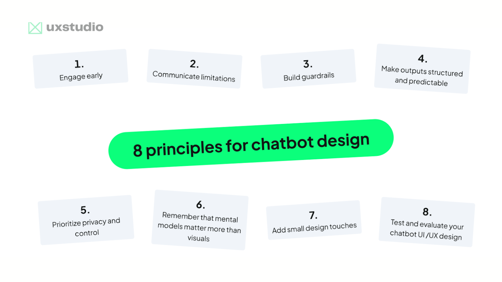
1. Engage early
In our experience, a common UX problem in AI chatbots is that users don’t know what’s possible: they don’t know what to ask or how the system can help them. This leads to low engagement.
To solve these issues, designers need to make the chatbot’s capabilities easily discoverable and intuitive to use. We suggest the following UI approaches:
- Onboarding hints: Show contextual tips when users first open the chat, such as “Try asking me about X” or highlighting key features step by step.
- Suggested starter prompts: Provide example queries or conversation starters directly in the chat interface, e.g., “Summarize a document,” “Generate a design idea,” or “Check grammar.”
- Quick replies / shortcuts: Use buttons or chips for common actions (like “Help me write an email” or “Translate text”) so users can interact without typing.
- Visible functions: Display clear menus, icons, or tabs that indicate available capabilities (e.g., text analysis, image generation, data lookup) and keep them accessible during the conversation.
Experiment with these options to strike a balance between helpful suggestions and overly complex UI.
2. Communicate limitations
Help users understand what the bot can and cannot do. Laura Sima, UX researcher at UX studio, notes that if users have to figure out the system’s limits themselves, they may develop unrealistic expectations, leading to disappointment, or over-rely on AI.
Indeed, automation bias is one of the biggest safety issues in AI, as this error is on the user side, not the bot side. We, humans, have a tendency to put our confidence in automated suggestions and overlook contradictory information. This can lead to errors of commission (blindly following AI recommendations) or omission (failing to detect AI errors).
To mitigate this, UX teams should first foster an internal culture of healthy skepticism, combining AI outputs with human expertise and contextual understanding.
Then they need to bake this approach into the system through warning labels, use of less definitive language, linking to outside sources, and encouraging fact-checking and follow-up questions. The black box approach no longer works: user expectations (and legislation) have changed, and design needs to adapt.
3. Build guardrails
In chatbots, error states are often subtle: there’s no obvious “404 page” when things go wrong. The interface itself must guide users through uncertainty. This requires planning for open-ended user inputs, flexible journeys, and unpredictable outcomes.
To manage this complexity, Google’s interaction design policies concept recommends defining policies around each critical moment where users interact with the AI. These policies outline four elements:
- Acceptable actions: what the AI should help users do.
- Unacceptable actions: outputs or behaviors the system must prevent.
- Thresholds of uncertainty: how the product handles weak or unreliable model results and how users recover from them.
- Vulnerabilities: risks or harms the model might introduce, from errors to cultural bias.
By articulating these criteria early, teams can align design, engineering decisions, and model safety work.
4. Make outputs structured and predictable
Structure beats verbosity. Chatbot UI should therefore prioritize short, scannable, and structured messages. We recommend using bullet points, cards, and progressive content.
At the same time, chatbots need to balance personalization with predictable behavior. Users trust systems that behave consistently: a stable tone, predictable responses, adjustable verbosity, and visible conversation history all contribute to confidence.
5. Prioritize privacy and control
Usage data can improve the system, but overreach is a risk, and can lead to violating regulations such as the EU AI act. It’s critical to clearly communicate what the system remembers, why it remembers it, and how long it retains information. Modern chatbots combine limited short-term context, expanding long-term memory, and dynamic retrieval systems, which makes memory management a challenging UX problem.
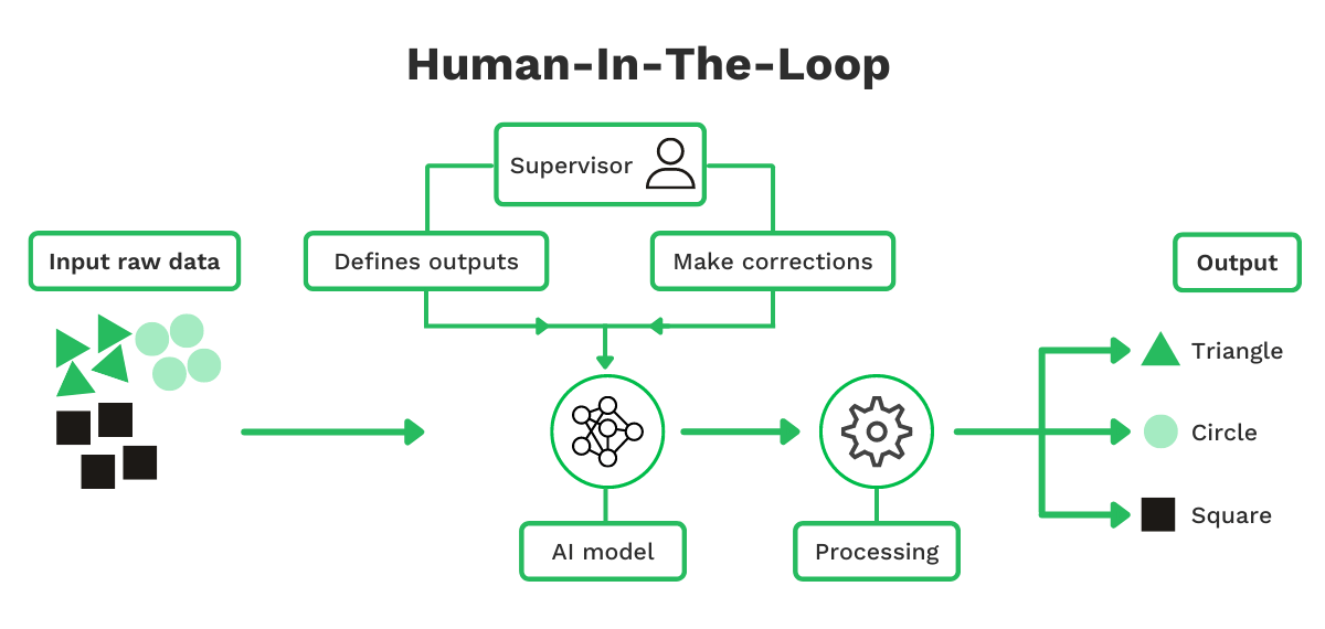
Maintaining a human in the loop is essential: even when AI is capable of complex tasks, human oversight ensures that outcomes match user intent, errors are caught, and results remain reliable.
From a design perspective, feature timing and context are crucial. AI capabilities should be available where they make sense, integrated naturally into the user journey, and not pushed unexpectedly.
Proper transparency, control, and oversight allow users to interact with the chatbot more safely while enabling the system to deliver value.
6. Remember that mental models matter more than visuals
Users generally approach chatbots with two models in mind:
a) Messaging app: users expect quick replies, clear affordances, natural language understanding, and free typing.
b) Command interface: users expect short commands, visible options, and predictable outcomes.
Good UIs help users converge on the right model quickly. When you’re uncertain about how your customers approach your model, UX research can reveal behavioral patterns and inform your design decisions with first-hand user feedback.
7. Add small design touches
Small UI elements can make a big difference. For example, to make AI chatbots feel responsive and keep users engaged, the interface should provide clear feedback on the system’s state:
- Typing indicators: Show when the chatbot is composing a response to manage user expectations.
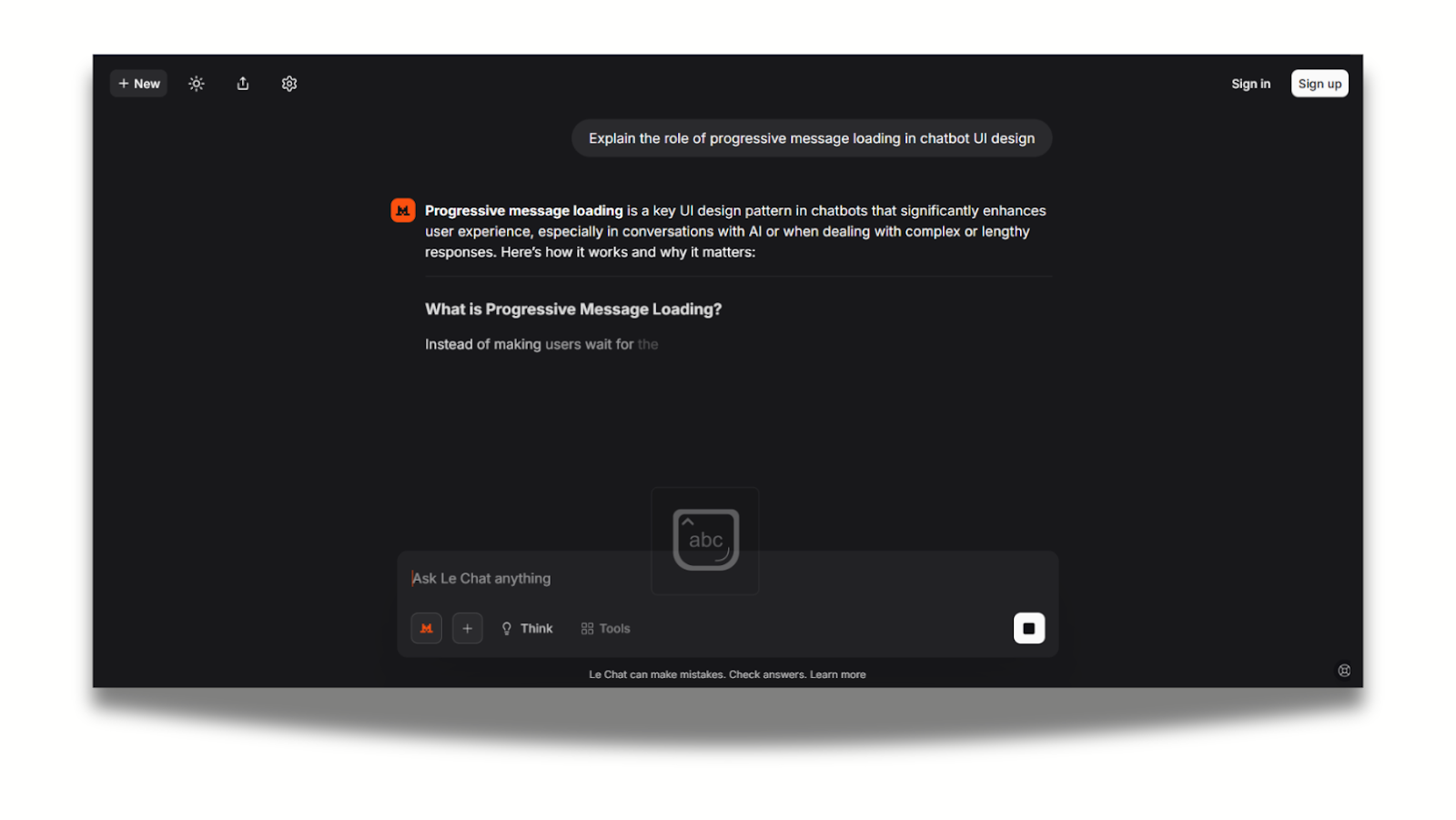
- Progressive message loading: Display messages incrementally rather than all at once for faster perceived response.
- Partial results: Present intermediate outputs for long-running tasks to maintain flow.
- Status badges / indicators: Signal success, errors, or ongoing processing for transparency.
- Subtle animations: Smooth transitions and micro-animations reinforce responsiveness without distracting users.
These micro-states improve perceived speed and make the experience feel smoother.
Additionally, modern AI chatbots can leverage multiple interaction modalities to improve usability, engagement, and efficiency.
- Quick replies / button chips: Pre-defined options for faster responses.
- Cards & embedded forms: Structured visual content and in-chat data submission.
- Media & file support: Images, previews, and uploads for richer context.
- Voice input/output: Hands-free and accessible interaction.
- Integration panels: Connect external tools or services directly within the chat.
By combining these modalities, chatbots can accommodate diverse user needs.
8. Test and evaluate your chatbot UI/UX design
Design should never rely on assumptions. Test your AI features early, often, and with a diverse group of users. AI usability testing should focus not just on whether users can complete tasks, but on how the model behaves, how predictable it feels, how users recover from errors, and whether the experience builds (or erodes) trust.
Combine task-based testing and error-state exploration to understand real user expectations, identify failure points, and refine guidance, prompts, and safety features.
If you need support, we’ve collected the best usability testing agencies that can help you gather reliable insights tailored to your product.
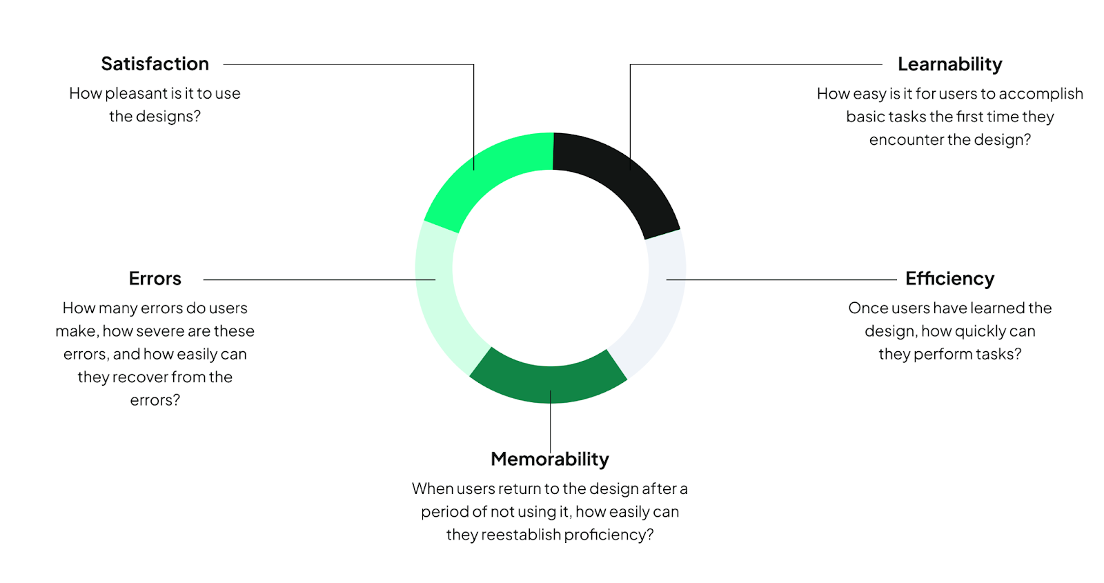
Assessing chatbot performance requires systematic metrics to ensure interactions are effective and satisfying. Frameworks like HEART measure Happiness, Engagement, Adoption, Retention, and Task success, while conversation design principles evaluate clarity, guidance, and predictability in dialogue.
Key operational metrics include task completion rates, number of re-prompts, and fallback frequency, which highlight where the chatbot fails or confuses users.
Sentiment curves provide insight into user frustration or satisfaction over the course of the conversation.
Together, these frameworks and metrics give designers and developers actionable insights to improve conversational flow, reduce errors, and enhance the overall user experience.
Conclusion
Designing an effective chatbot UI requires understanding users’ mental models, guiding interactions, and providing clear feedback while balancing privacy, control, and AI limitations.
Partner with UX studio to create a chatbot UI that’s intuitive, responsively designed, and built specifically for your users’ needs.