slider dot styling

Fix usability issues hurting your growth

Get expert UX insights and  tailored recommendations for your SaaS after a short consultation.
Start with a free consultation

What you’ll get

Consulting session tailored to your  product and context
Clear identification of your  core UX issues
Practical, prioritized recommendations
A comprehensive report with actionable tips

Real examples from past reviews

1
The hamburger icon is unnecessary on desktop, does not serve any purpose here, when closed the icons are not clear (but it is going to be useful on mobile)
2
The gray color of menu items indicate that they are disabled, even when we are on the page
3
The 'glasses' view icon is not intuitive (hard to find, people would click on the whole row instead of a specific icon to find out more), plus the cursor is not changing when we move over a row, so everything seems clickable in the table.
4
Previous button placement is very unfamiliar
  • No clear call to action anywhere on the page
  • It’s hard to know where I am at the moment and how I got there
1
Overuse of the blue color, not clear what is a button what is not, what is clickable, nothing to lead the eye (profile pops up because of the dark color but that shouldn't be the focus)
2
Inconsistent look of the icons (colored or black)
3
Unnecessary, very big header
  • First impression: Does not seem like a dashboard
  • Users have no idea where to focus at first
4
Tables are really small, hard to read
5
Selected filtering aspect is not prominent enough, seems inactive
6
No labeling or coding in charts, it's very hard to interpret them
7
Lot of unnecessary white space and everything is small
8
No hierarchy at buttons anywhere on the pages (no primary and secondary buttons), can also cause problems in navigation and not prompts error prevention
9
Proximity and padding is off, there is a lot of space between columns in summary pages with no hierarchy (not clear what is a title) hard to read and skim through
1
Filter placement is really off (maybe not even needed for the dashboard)
2
Tabs and header are not making much sense for a dashboard
3
Not user friendly that the profile section is not editable and the placement is very prominent as is
  • No error prevention. Missing undo actions and feedback when performing an action
  • Copy issues: Things named differently on different pages, error messages and  table headers are not specific enough.
1
Icons color and placement varies between pages, they all should be on the left
2
Filter is out of place very far from the table and graph so it's not clear what does it have an effect on, it's not a familiar pattern
3
The apply button placement is wrong and  the icon that is a refresh sign is also confusing (the button can be gone by applying the filters on selection)
4
Filter's default state is ”All” instead of empty
5
Same icons are used several times for different purposes (dollar sign, refresh)
6
Actions affecting the tables (GPOs, contracts) should not be in the header, but closer to the table itself
  • Affordance is missing, buttons and clickable items are too small, hard to click with the cursor
  • Buttons states are inconsistent, there is no feedback on hover, click.
A black and white image of a board with design suggestions
Our 3-step process
  1. Submit a short application describing your SaaS product's biggest challenge.
  2. Join a free consultation with a UX expert.
  3. Get a tailored report with actionable insights and tips, no obligations.
Decorative green and black "no payment, no cost, no obligation" text

Limited time offer

Submission of the contact form does not constitute a guarantee that a UX review will be provided due to limited capacity.

If you have questions about these limitations, please don’t hesitate to contact us.
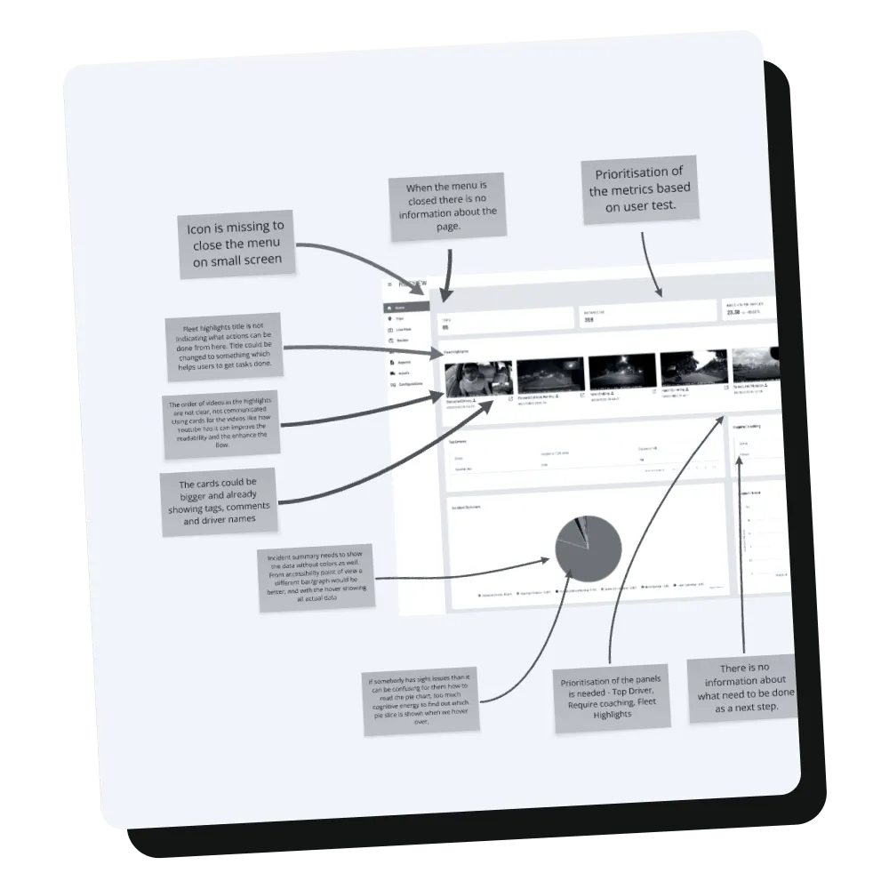
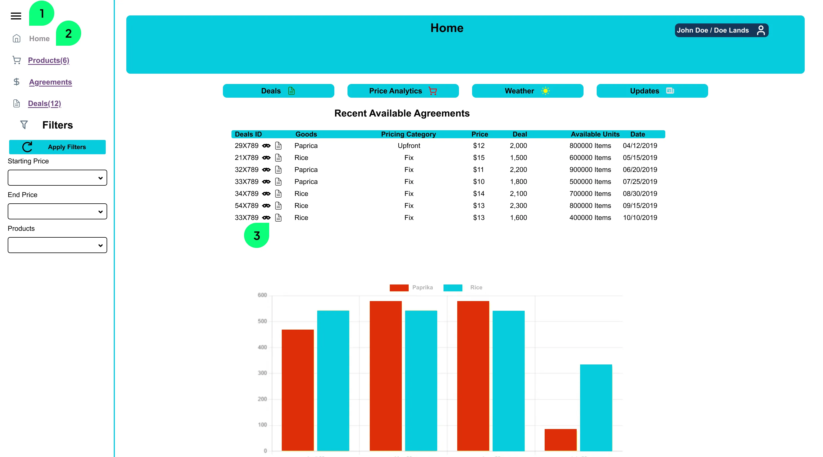
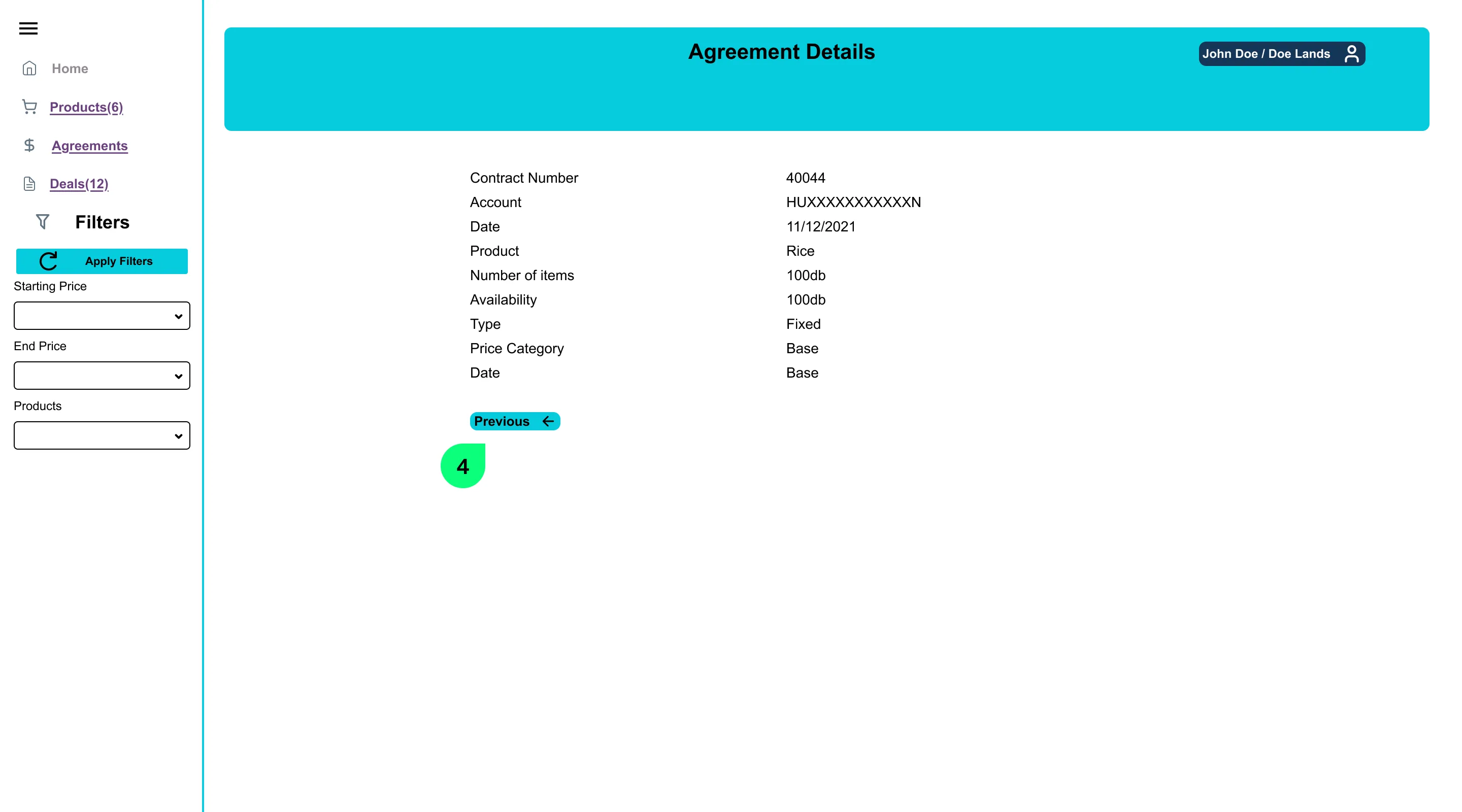
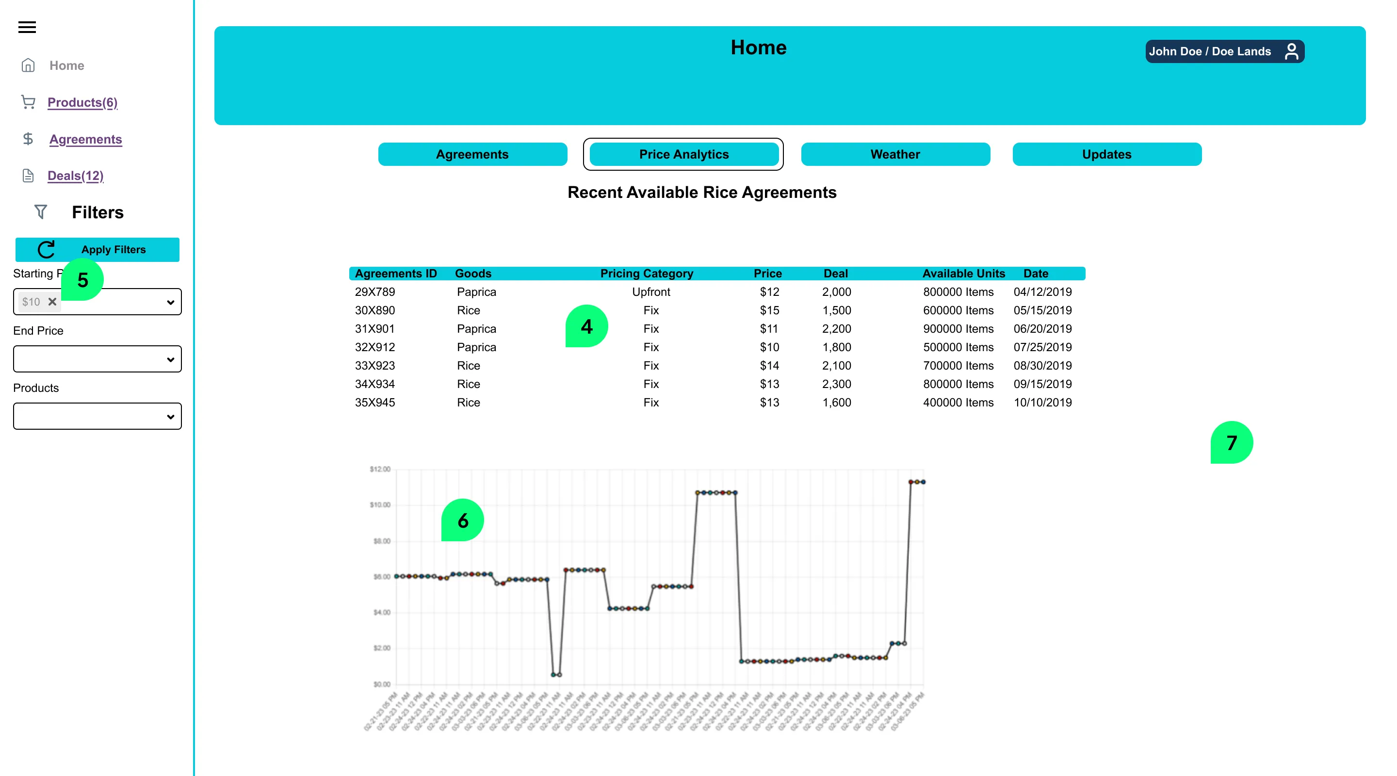
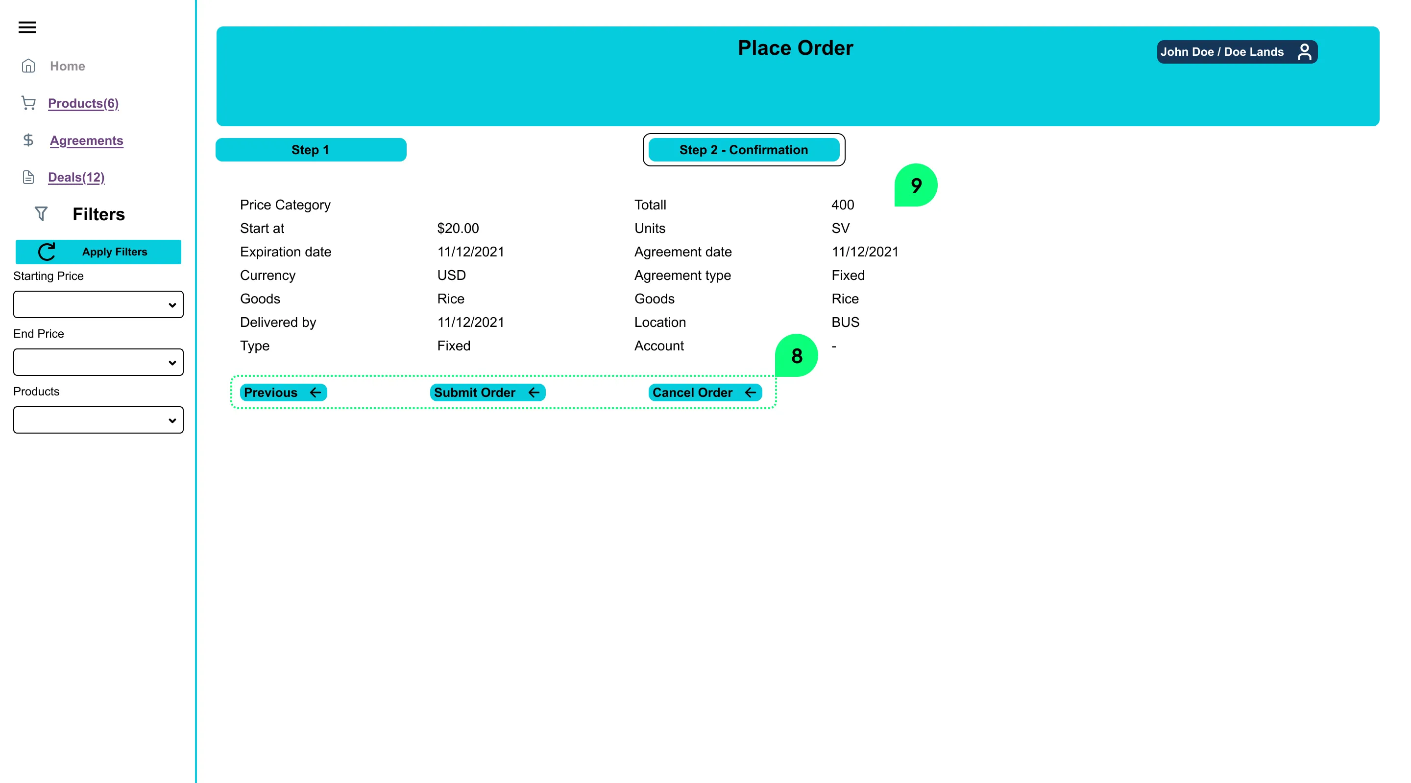
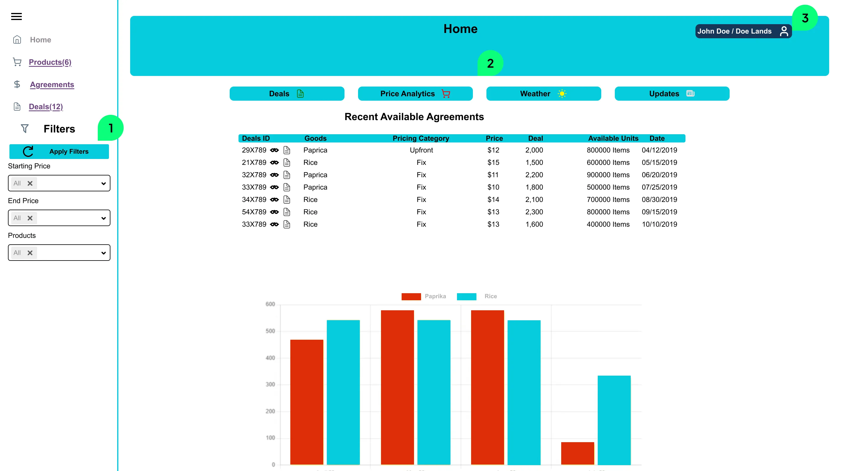
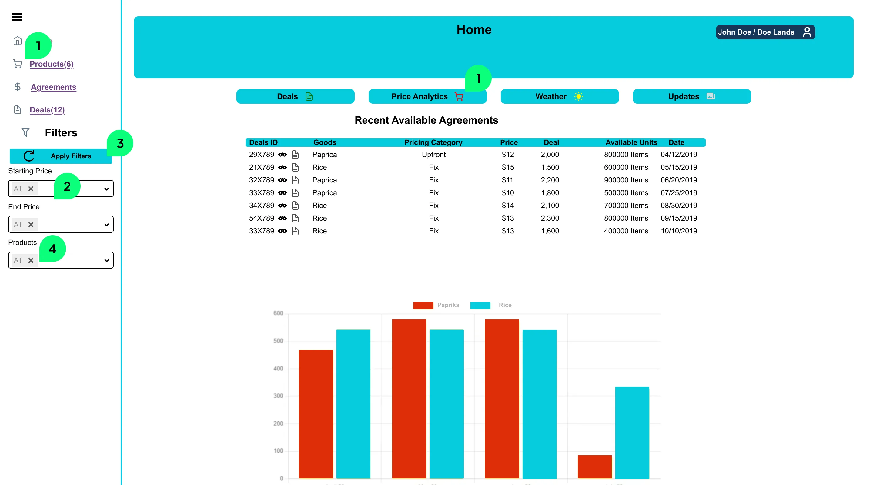
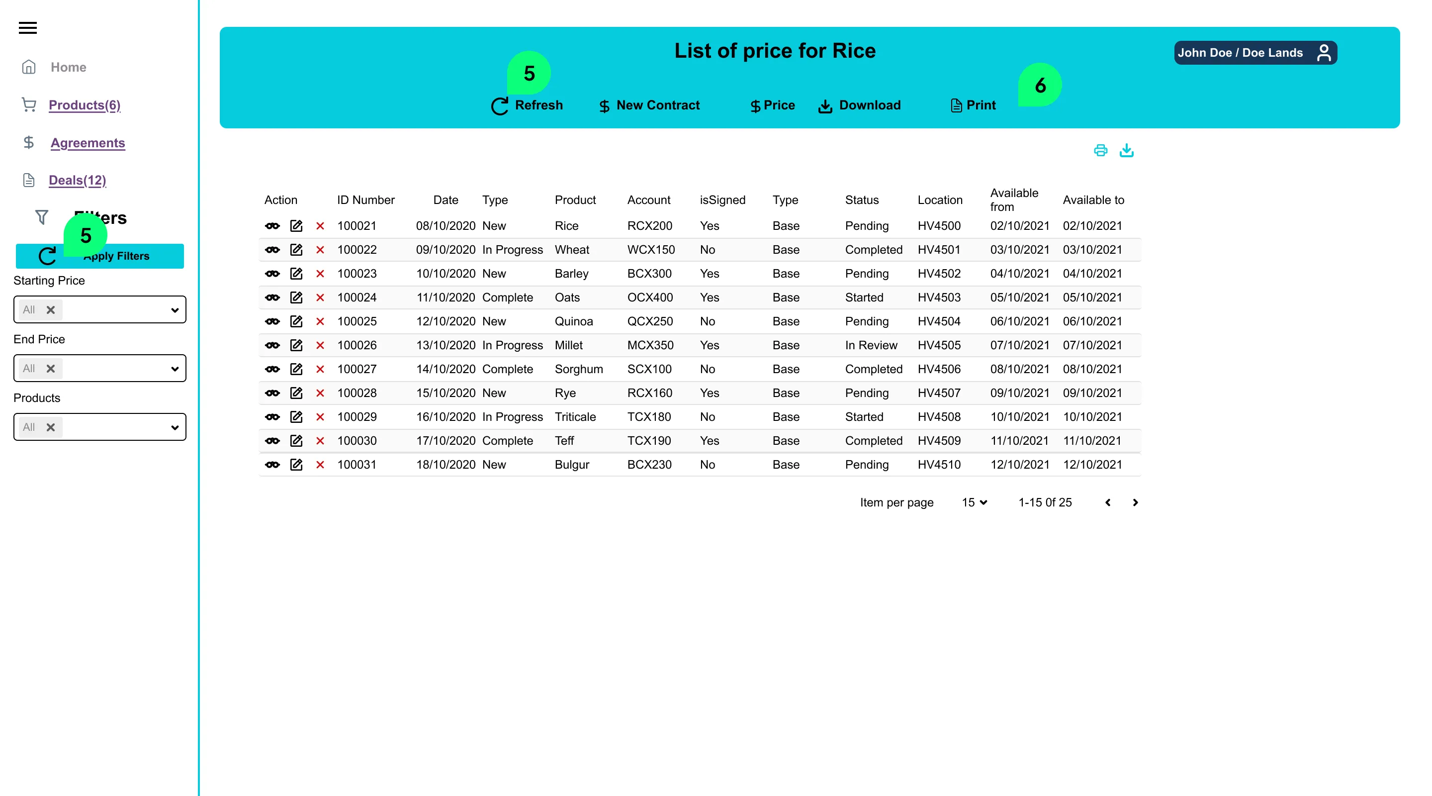
A black and white image of a board with design suggestions
When metrics drop, but the reason isn’t obvious

Are your users...

- inactive?
- missing key features?
- struggling with onboarding?
- dropping off at key points?
- reporting recurring problems?

Why UX studio?

We’re expert SaaS-fixers with 10 years of experience and a 5-star Clutch rating.

We’ve helped  SaaS companies rely on real user insight and expert advice instead of guesswork and internal debates.

We typically work in embedded teams on long-term projects, so we offer this opportunity now in the hopes to earn your trust, prove our worth, and partner up with you in the future. 

A black and white image of a large group of UX studio employees
Laura Lovejoy
General Manager at
TrustDALE

"The final report exceeded our expectations."

Aleksandra Lipovac
Product Design Lead at
Syskit

"I was impressed by their focus on understanding our work and the specific use cases we deal with."

Martha V. Pearlstone

“They were a 'quick study' in terms of understanding our category rapidly."

Slavka Sakata
Climate Change Adaptation Coordinator at
NIES

"The whole process was very smooth and items (report, hand-over meeting) were delivered on time. UX studio made sure to understand the background of the website and the industry, as well as our main concerns and needs, and reflect them in the UX review process. Their friendly approach and professionalism were impressive."

FAQ

Want to learn more?

Sign up to our blog and get monthly notifications with a summary of our latest posts.
Thank you! You have been subscribed!
Oops! Something went wrong while submitting the form.